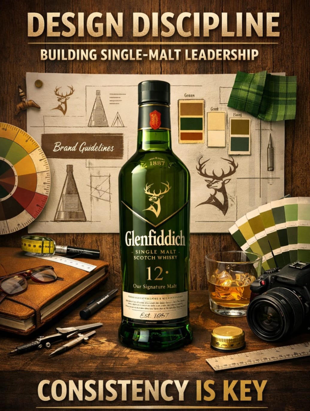
Glenfiddich’s rise in the US since its 1963 entry is less about distribution muscle and more about disciplined brand design. At a time when blended Scotch dominated, the brand leaned into a distinct visual identity—most notably its triangular bottle and consistent packaging codes—to signal difference and premiumisation. Decades later, that design system continues to anchor its global positioning even as the whisky category fragments and premium competition intensifies. The key move is restraint. Instead of frequent reinvention, Glenfiddich has evolved its design language incrementally—keeping recognisable assets intact while adapting to modern retail and digital environments. This ensures shelf visibility, recall, and pricing power across markets. For Indian marketers, the takeaway is straightforward. As premiumisation accelerates across alcobev, QSR, and D2C categories, brand identity systems—not just campaigns—are becoming long-term growth drivers. India’s market still over-indexes on tactical refreshes and festive packaging spikes. Glenfiddich’s playbook suggests that consistency compounds more effectively than periodic disruption. There’s also a distribution angle. In cluttered retail environments—offline and quick commerce alike—distinct structural design (shape, color, typography) functions as media. This reduces dependence on paid visibility over time. The future implication: as Indian brands chase global aspirations, design will need to move from execution to strategy. One sharp observation: In premium categories, what doesn’t change often matters more than what does.
Global
Use of Design Consistency enables Glenfiddich to Sustain Premium Leadership in a Shifting Scotch Market